

The “pause” in global warming has reached a milestone of 17 years with no net warming. This has been very inconvenient for “warmist” scientists and policy makers. There have been many excuses proffered to explain the pause (See: “The ocean ate my global warming below”). And, there have been more scare stories in the media (See: “Risky Business debunked” below).
Back in 2011, a study by a group of pro-catastrophic global warming scientists determined that the human CO2 warming influence on atmospheric temperatures would become obvious over a period of 17 years of satellite measurements. The paper is Santer et al., 2011, Separating signal and noise in atmospheric temperature changes: The importance of timescale, Journal of Geophysical Research (abstract here). The bottom line of the abstract says: “Our results show that temperature records of at least 17 years in length are required for identifying human effects on global-mean tropospheric temperature.”
As of June, 2014, it has been 17 years since the super El Nino of 1997/1998 and there is no obvious signal that increasing CO2 emissions have had any effect on global lower troposphere temperatures. In fact, over the last 17 years, temperatures show a slight cooling trend. See this article and graph from C3Headlines (that graph uses RSS satellite data). See also the latest data from UAH satellites courtesy of Dr. Roy Spencer here. There is some slight difference between RSS and UAH satellite data as explained by Spencer here. Another C3Headlines article shows that “NOAA Confirms: Huge CO2 Emissions Have Zero Impact On U.S. Maximum Temperatures.” (Link)
Once again we come back to a basic fact about global warming alarmism: There is no physical evidence supporting the contention that CO2 emissions play a significant role in driving global temperatures. Such a role for CO2 exists only in computer models.
Fun with graphs:
NOAA maintains a website called “Climate at a glance” http://www.ncdc.noaa.gov/cag/ where you can construct your own graphs of temperature data. I played with it a bit.
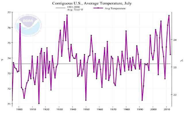
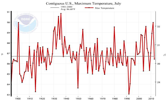
Here are graphs for average July temperatures and maximum July temperatures for the contiguous US from 1895-2013. No sign of CO2 influence:
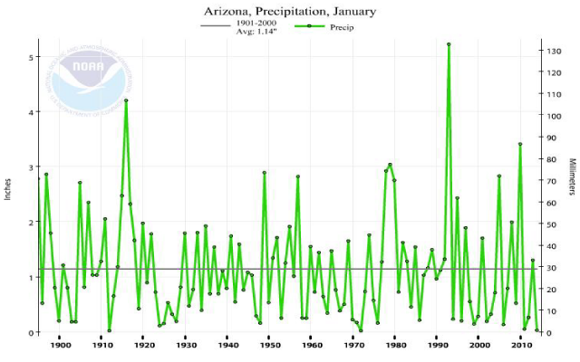
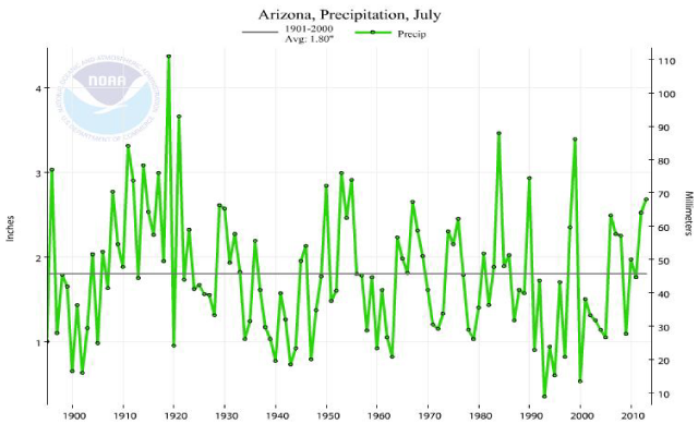
We can also play with precipitation data. Below I plot Arizona precipitation for January and July, our two rainy seasons. We see quite a bit of variation but no trend:
In a separate article, Anthony Watts points out some problems with global precipitation records. According to a recent paper published in Atmospheric Science Letters, global precipitation has either decreased, increased, or not changed over the past 30 years, depending upon which of three global datasets are examined. Thus, the actual trend of global precipitation, if any, remains a mystery. (Read full post).
Note: Satellites do not measure temperature directly. Instead, they measure the radiance of oxygen, in several wavelengths, which is proportional to temperature.
More on climate change:
The ocean ate my global warming – part 1
The ocean ate my global warming – part 2
Some basic facts on carbon dioxide and climate
Carbon dioxide and the greenhouse effect
Climate change in perspective (A tutorial)
The past is getting cooler (This deals with government data manipulation)