

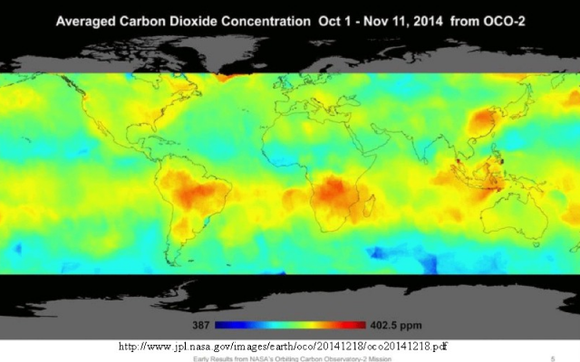
Results from NASA’s Orbiting Carbon Observatory show that atmospheric concentration of carbon dioxide is highest in the Southern Hemisphere (or very close to the equator) – not in the areas of all that fossil-fuel burning in the Northern Hemisphere.
In July, 2014, NASA launched a satellite which is dedicated to measure atmospheric carbon dioxide concentration from space. NASA describes it as follows:
“The Orbiting Carbon Observatory 2 (OCO-2) is NASA’s first dedicated Earth remote sensing satellite to study atmospheric carbon dioxide from Space. OCO-2 will be collecting space-based global measurements of atmospheric CO2 with the precision, resolution, and coverage needed to characterize sources and sinks on regional scales. OCO-2 will also be able to quantify CO2 variability over the seasonal cycles year after year.”
NASA has just released data from that satellite for the period October 1 through November 11, 2014. Brighter colors on the map show areas with higher concentrations of carbon dioxide in the atmosphere. Presumably, those areas are emitting carbon dioxide. The surprise is that the Southern Hemisphere is the big emitter during this time period, not the Northern Hemisphere where we are burning fossil fuels to generate electricity, run our automobiles, and heat our homes and businesses. The only exception seems to be China where they are burning great quantities of coal.
So what accounts for all those emissions in the Southern Hemisphere? Here I will do some speculation.
Hot spots occur in the Amazon and in sub-tropical Africa. There, carbon dioxide emissions could be coming from rotting vegetation.
The hot spots in the Western Pacific (right side of graphic above) are interesting. Martin Hovland, Geophysicist and Professor Emeritus, Center for Geobiology, University of Bergen, Norway, suggests these carbon dioxide emissions are from volcanoes and tectonically active areas on the sea floor. (See his post here).
Hovland presents an annotated version of the map above:
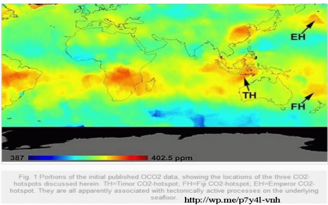
Hovland writes:
“Using the Smithsonian Volcano database, it is seen that these CO2-hotspots occur above seafloor features which are suspected to issue CO2, CH4 and occasionally large amounts of heat (especially for FH and EH). Here, it can be seen that the TH occurs over a deep-water accretionary subduction wedge. This is a collision zone, where huge amounts of oceanic sediments pile up before they sink into and are swallowed up beneath the island masses to the north. In such settings, it is well-known that continuous seepage of methane occurs out of the seafloor. Therefore, it is here speculated that the underwater and aerial oxidation of this excess methane gas provides the regional CO2-anomaly detected by OCO2.
The seafloor beneath the FH is also highly tectonized (Fig. 3), but in a completely different fashion to that of the TH. At Fiji, there are both colliding plates and rifting zones. The whole region is highly contorted and there are lots of seepage, both hot vents and cold, methane-dominated vents. Transmittal of methane and CO2 to the atmosphere is likely also here.” (Note: methane quickly reacts with oxygen to produce carbon dioxide.)
These tectonically active areas contain many sub-marine volcanoes.
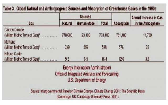
NASA has (perhaps unwittingly) provided proof that natural carbon dioxide emissions are responsible for most of the rise seen in atmospheric carbon dioxide. In fact, in 2001, the Energy Information Administration produced a table which shows (with a little arithmetic) that anthropogenic activities account for only 3 percent of the total annual carbon dioxide flux.
Now, look back at the first graphic. Notice that the mapped range is 387ppm to 402ppm, a difference of 15ppm. Near-surface daily variation can be greater than 30ppm, but NASA claims that variation range decreases with altitude.
Some questions: Is NASA measuring something real? What is the actual range of instrumental error? Does the human contribution fall within that error range? See if you can figure out instrumental error from a rather dense NASA document here.
For some perspective, I remind you that your exhaled breath contains 40,000ppm carbon dioxide.
Your carbon footprint really does not matter. See some calculations on my Wryheat blog: Your Carbon Footprint doesn’t Matter
By the way, back in November, NASA released a computer-generated animation video of global carbon dioxide concentrations based on computer modeling conducted in 2006. The input data were surface measurements of carbon dioxide emissions from burning fossil fuels and completely ignored natural sources. That computer-based model is pretty, but seems to be contradicted by actual measurements by the satellite system. The video, for some reason, puts the highest carbon dioxide concentrations in the Arctic. Another case of garbage in, garbage out. Take a look here.
See also:
Carbon dioxide and the greenhouse effect
What keeps Earth warm – the greenhouse effect or something else?
Evidence that CO2 emissions do not intensify the greenhouse effect from Wryheat