

On January 20, 2016, the National Oceanic Atmospheric Administration and NASA announced that 2015 was by far the hottest year in 136 years of record keeping. NOAA said 2015’s global temperature average was 58.62 degrees Fahrenheit.(Source)
Apparently, NOAA did not check its own temperature record, because their report on 1997 (another El Nino year) said that the global average temperature was 62.45 degrees Fahrenheit (and it was touted as the warmest year on record). (Source) Here is a screen capture, just in case the 1997 report disappears:
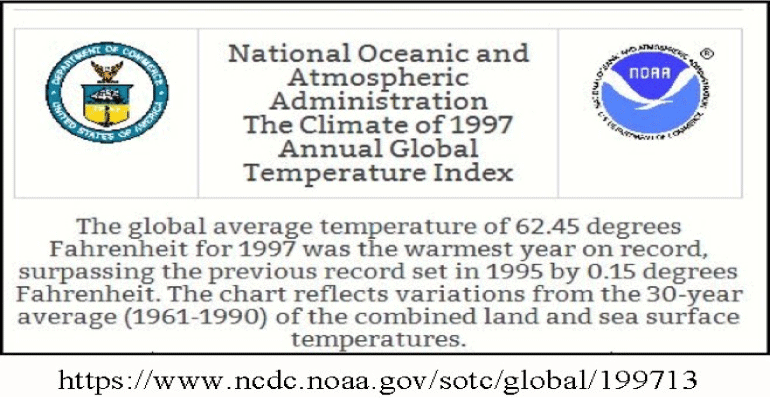
Even in the new math of “Common Core” 62.45 is still larger than 58.62.
NOAA bases its projections on surface temperatures and completely ignores satellite data. The satellites have been in operation since 1979. The UAH satellites show that 2015 is the third warmest year in the period, whereas the RSS satellite system puts 2015 in fourth place.
NOAA and NASA have been systematically “adjusting” the surface temperature record, making the past cooler so the present seems warmer, see The past is getting cooler and Temperature trends published by NOAA 50% too high.
Some caveats on the numbers game:
Just how does one calculate the average global temperature? Think about that. Is the number really of any use?
NOAA and NASA usually show temperature anomalies rather than true temperature. They pick a base period and report how measured temperatures depart from that base average. For instance, for 2015 NOAA reports: “During 2015, the average temperature across global land and ocean surfaces was 1.62°F (0.90°C) above the 20th century average.” How does one determine a global average for the 20th century? NOAA and NASA also report numbers based on 30-year baselines. In 1997, NOAA used a base period of 1961-1990. Moving the goal posts of those base periods can lend itself to much mischief. “Without the adjustments and homogenization, the post-1960 US temperatures would be indistinguishable from the early 20th century.” David Middleton [link]
To put the 2015 global temperature in perspective, let’s take a look at the entire Holocene period. From this perspective 2015 looks like the 8000th warmest year.

It seems that our Federal “scientists” are more into political science. “It is difficult to get a man to understand something, when his salary depends upon his not understanding it!”- Upton Sinclair.
Note to readers: I have constructed a linked index to more than 300 of my ADI articles. You can see it at: https://wryheat.wordpress.com/adi-index/
You can read my comprehensive, 28-page essay on climate change here: http://wp.me/P3SUNp-1bq